Pass*Field API
This page describes Pass*Field javascript API. This is a technical documentation. For simple configuration, please go to live demo page.
Installation
To install Pass*Field, download the code and include js and css in your markup:
<script src="passfield.js"></script>
<link rel="stylesheet" href="passfield.css"/>
Add the password field (note the placeholder attribute: it will work on old IE versions too):
<div class="control-group">
    <input type="password" id="mypass" placeholder="your password" />
</div>
Initialize the field with jQuery:
$("#mypass").passField({ /*options*/ });
Or, if you are not using jQuery, here's the code for raw javascript:
var passField = new PassField.Field("mypass", { /*options*/ });
Make sure that your path to the images (“rand” icon) is correct: if you put them in different folder, check your CSS file and change the path if it differs.
Options
Options is a javascript object that is passed in initialization function. You can try different options setup on the live demo page.
Defaults
You can pass empty object or skip it at all - missing options will be taken from defaults. To see the defaults, you can eigther inspect js files, or view them on the live demo page: when you just load it without changing anything, defaults are applied. Also, defaults are stored in PassField.Config.defaults object.
pattern
is used to calculare password strength and also for password generation. Example patterns:
- abc123 – good password must contain letters and numbers and be 6 characters long;
- aA – it must contain letters and UPPERcase letters and be 2 characters long;
- ab$3 – it must contain letters, digits and symbols and be 4 characters long.
There are 4 groups of characters: letters, UPPERcase letters, digits, symbols. Everything that is neigher letter, nor digit is considered to be a symbol (see chars and allowAnyChars parameters for more info).
Validation
acceptRate
Pass*Field uses its own algorighm to calculate password strength (you can get calculated strength value in validationCallback). Password strength is a value in range 0..1 (1 is strong). Factors taken into attention when strength is calculated:
- length – length percentage is calculated and subtracted from strength (e.g. password “123” has strength 0.75 with pattern “1234”);
- symbols usage – password “a1” consists of letters and digits; password “a1%” contains also symbols. If a pattern contains character type but password does not, password strength is decreased. So, if we have pattern “abc123”, password “abc” will be weak but password “b2” is strong (by this parameter). The number of characters of each type does not matter;
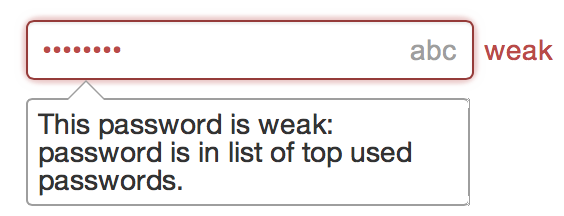
- black-list – there's a list of commonly used passwords. If the password belongs to this list, its strength is considered to be 0 (e.g. password “querty”). Pass*Field has this list built-in but you can specify additional passwords in
blackListparameter; - characters – if the password consist only of repeating character (like “11111” or “aaaaaa”), it will be considered weak;
- non-matching field – if the password is equal to
nonMatchFieldfield value (if any), it will be also considered weak.
Please note: default value for this parameter is 0.8; this means that a password with length a bit less than one of the pattern is considered ok. If this is not what you wish, you can change this rate to achieve more or less strict password checking. Passwords are always generated with rating = 1.
If you need more info, please refer to calculateStrengthAndValidate function.
Tip: if you are creating a password field without strength validation at all, pass acceptRate: 0.
allowEmpty
defines whether validation error will be shown if the password field is left blank.
isMasked
Password will be initially masked if isMasked is true; otherwise it will be shown as cleartext. In case of isMasked is true, if the user switches focus to another field, after several seconds of inactivity the field will switch back to masked mode.
validationCallback
Each time Pass*Field validates password strength, it calls validationCallback function (if any). If you wish, you can override measured strength and messages by returning your custom result from this function (but this is not required: you can just skip return). Example of implementation:
/**
  * @param {Object} el - DOM element with password (this is your input).
  * @param {String} validateResult - validation result object.
  * @param {Number|Object} validateResult.strength -
  *     calculated password strength [0..1] (null if the password is not valid).
  * @param {String[]} validateResult.messages -
  *     messages with found violations (from localization settings).
  * @return - used to show warnings or errors
  */
function validatePassword(inputEl, validateResult) {
    // your code here

    // you can safely skip return: the following is used only to override check result
    // here's how return strength warning:
    return { strength: 0.5, messages: ["your message here"] };
    // and in this case password will be considered invalid:
    return { strength: null, messages: ["your message here"] };
}
$("#mypass").passField({ validationCallback: validatePassword });
If you return empty (or null) messages, you can only increase strength (compared to the strength returned from internal validation). If the strength is decreased without any message, the result will be disregarded: there's no need to show “unknown error” to the user, such behavior is very confusing. So if you don't specify a message, the only thing you can do is make Pass*Field think that invalid password is valid (by increasing returned strength). In other words, if you force to set decreased strength, please explain why the password is invalid or weak.
blackList
You can specify list of unwanted passwords in blackList parameter. By default, the list of top passwords is provided but can add additional items here. The user will see a warning that it's not the best idea to use this password:
Optionally, to disable the global blacklist (built-in list of top passwords), insert the following code before initizalizing Pass*Field:
PassField.Config.blackList = [];
allowAnyChars
controls whether the it is allowed to enter characters that are neigher letters, nor digits, nor symbols (see chars parameter for more info).
checkMode
allows to choose from different password checking modes:
PassField.CheckModes.MODERATE– more user friendly: if a password is better than the pattern (e.g. longer), its strength is increased and it could match even not containing all char types. E.g. if the pattern is “abc4”, in this mode the password “abcdefghijklmn” will be considered strong: it doesn't have digits but is much longer. Also, the password “a#4^_F” will be considered strong against the rule “1234567890” even its length is smaller: this password has different char types and is a good one;PassField.CheckModes.STRICT– more strict: it a password is longer than expected length, this makes no difference; all rules must be satisfied.
chars
is used to override default lists of character types which are:
chars: {
    digits: "1234567890",
    letters: "abcdefghijklmnopqrstuvwxyz",
    letters_up: "ABCDEFGHIJKLMNOPQRSTUVWXYZ",
    symbols: "@#$%^&*()-_=+[]{};:<>/?!"
}
E.g. you may want to treat other unicode letters as letters (and not as symbols), so you should add these letters in such way:
chars: {
    letters: "abcdefghijklmnopqrstuvwxyzσβασ"
}
You can cpecify additional letters here but for password generation latin letters will be used if they are present in chars.letters.
nonMatchField
If you have a login field on your page, you can specify it here; if the password is equal to login, error will be shown. You can pass either element id, or element itself, or jQuery selector here.
length
Enables strict password length checks. Even in moderate validation mode, password length must be between length.min and length.max (input field maxlength will be also changed if this option is set). You can specify either only min, or only max, or both.
length: { min: 8, max: 16 }
Events
The following events are available:
generated
Triggered when the password is generated.
$("#mypass").on("pass:generated", function(e, pass) {}); // jQuery
new PassField.Field("mypass", { /*options,*/
    events: { generated: function(pass) {} } }); // no jQuery
switched
Triggered when the password display mode is switched.
$("#mypass").on("pass:switched", function(e, isMasked) {}); // jQuery
new PassField.Field("mypass", { /*options,*/
    events: { switched: function(isMasked) {} } }); // no jQuery
UI Elements
showToggle
enables user to toggle password masking with “•••/abc” button. If you disable masking but enable generation, the field will switch to cleartext mode when the user generates a password; there will be no way back.
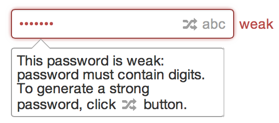
showGenerate
adds button for random password generation. When the user clicks this button, password will be automatically shown in cleartext.
showWarn
Warning (red text to the right of the field) is only shown if showWarn option is set to true. Otherwise it's your responsibility to show warnings. For example, you may want to implement custom validation UI – in this case you should disable this option and add custom validation controls.
showTip
enables help balloon with tips how to create a strong password. Tips are visible only when the field is focused. If password generation is enabled, user will see the explanation, how to generate a password. Here's an example of such tip (balloon below the field):
tipPopoverStyle
If Twitter Bootstrap is present, the tip will be displayed as Bootstrap popover. You can control popover options using this parameter (e.g. change title). If you want to disable Bootstrap popovers at all and use Pass*Field internal popovers, pass null here.
strengthCheckTimeout
Passwords are checked not immediately but after a small timeout: strengthCheckTimeout milliseconds. This ensures that if the user is typing a password, he will not see the warning until he has stopped typing. The user is less annoyed in such way (you are unlikely to change this parameter but if there's anything special, you can).
locale
All messages used in Pass*Field are defined in locales. You can select locale using locale parameter (this is ISO 639-1 Alpha-2 code, e.g. “en”). By default (if you pass null or empty) the locale is read from browser settings but you can specify certain locale here. If the locale is not found, neutral language (English) will be used. Currently supported languages: en, de, fr, it, ru, ua, es, el, pt.
localeMsg
You can specify different i18n messages. To see the full list, please refer to PassField.Config.locales.en.msg – the meaning of the messages is self-descriptive. If you pass only several of messages here, missing messages will be taken from the used locale.
warnMsgClassName
is a name of the CSS class added to warning element. By default, Bootstrap help-inline class is used. This class is not prefixed. Pass empty string if you don't need this feature.
errorWrapClassName
is a name of the CSS class added to wrapping element if validation error occurs. By default, Bootstrap error class is used. This class is not prefixed. Pass empty string if you don't need this feature.
Interface
After Pass*Field is created, you might want access it. Here's how:
toggleMasking
Toggles between masked and cleartext mode.
$("#mypass").toggleMasking(); // toggle mode
$("#mypass").toggleMasking(true); // switch to masked mode
$("#mypass").toggleMasking(true); // switch to cleartext mode

passField.toggleMasking(); // toggle mode (raw javascript - args are the same)
setPass
This method is used to set the password field value:
$("#mypass").setPass("pass"); // jQuery
passField.setPass("pass"); // raw javascript
val
To get the password field value, you can use standard methods for getting input values:
val = $("#mypass").val(); // jQuery
val = document.getElementById("mypass").value; // raw javascript
Warning: you should avoid using $.val(...) for setting password value; please use setPass instead.
validatePass
immediately validates the password and returns boolean validation result:
isValid = $("#mypass").validatePass(); // jQuery
isValid = document.getElementById("mypass").validatePass(); // raw javascript
getPassValidationMessage
returns validation error (null if there's no error) generated during the last validation:
msg = $("#mypass").getPassValidationMessage(); // jQuery
msg = document.getElementById("mypass").getPassValidationMessage(); // raw javascript
getPasswordStrength
returns strength measured during the last validation. null means that the password is invalid (not weak but really invalid, e.g. contains bad characters); -1 is returned if the strength has not yet been calculated; numeric value in range 0..1 will be returned otherwise.
This method allows to distinguish between invalid and week passwords.
placeholder
Placeholder is set in HTML:
<input type="password" id="mypass" placeholder="your password" />
If the browser is old and doesn't support placeholders feature, fake placeholder is used.
If you are using shim libraries that enable placeholders, this may cause problems. To resolve the issue, you can either exclude the password field from simulation of placeholders (in your shim library), or use data-placeholder attribute instead.
Please note: placeholder is not localized automatically because it's a part of your markup. As in other markup on the webpage, it's your responsibility to set the placeholder text based on the user locale. Here's how the placeholder text is set on the demo page (of course, if you wish, you can use it too; ensure that placeholder attribute is set before Pass*Field initialization):
var locale = settings && settings.locale || navigator.language && navigator.language.replace(/\-.*/g, "") || "en";
var placeholder = (PassField.Config.locales[locale] || PassField.Config.locales["en"]).msg.pass;
$("#mypass").attr("placeholder", placeholder);
Compatibility
Pass*Field does not require any framework to run. However it's tested with popular javascript and CSS frameworks.
jQuery
If jQuery is present, you can make use of jQuery plugin, it will be installed automatically. jQuery is an option, not a requirement.
jQuery.Validation
If you use jQuery.Validation plugin, please see a setup guide on jQuery.Validation page.
Twitter Bootstrap
Pass*Field supports Twitter Bootstrap styles. If you use this framework, you will not need any additional CSS work for “native” loook and feel. For better styles match, use this markup:
<form class="form-inline">
    <div class="control-group">
        <input type="password" id="mypass" placeholder="your password" />
    </div>
</form>
Other
CSS classes and IDs generated by Pass*Field are prefixed (with a_pf- prefix), so it's unlikely there will be any conflicts. If the field is still looking wierd, you can customize classes in passfield.css or change CSS that affects Pass*Field appearance, or write me about a possible bug (if you think it's a bug). Also there are some non-prefixed classes (for Bootstrap); you can change them using options.
Browsers Support
Desktop
Pass*Field is tested on all modern browsers (Safari, Chrome, Firefox, Opera, Internet Explorer) under Mac OS X, Windows and Ubuntu. IE is supported in full starting from version 7. IE6 users will not be able to access some features like triangle border in tooltip and and images transparency.
IE10 provides “reveal password” button but it lacks some features: you can neither copy the password, nor show the password in cleartext by default. Also there's no such button in mainstream browsers: only IE has it. That is why there's no option to leave it: this button will be hidden and replaced with “toggle password” button.
Mobile
I've tested the script under Safari and Chrome under iOS and Android, and it runs smoothly. Other browsers should be ok too.